- NICK LUSK
- NICK LUSK
- NICK LUSK
- NICK LUSK
- NICK LUSK
- NICK LUSK
- NICK LUSK
Data Viz Examples: Design and Engineering
Excluding the very last example, these are all taken from the same data visualization project. I was tasked with both development and design on this project as the entire team was composed of myself. That said, the executive I reported to had an abundance of great ideas, and impeccable taste, which helped tremendously. Typically, I prefer working on a team although I can't deny I had a lot of fun doing everything, and I would relish doing a project like this again. Specifically, I would be delighted to get another data visualization gig.

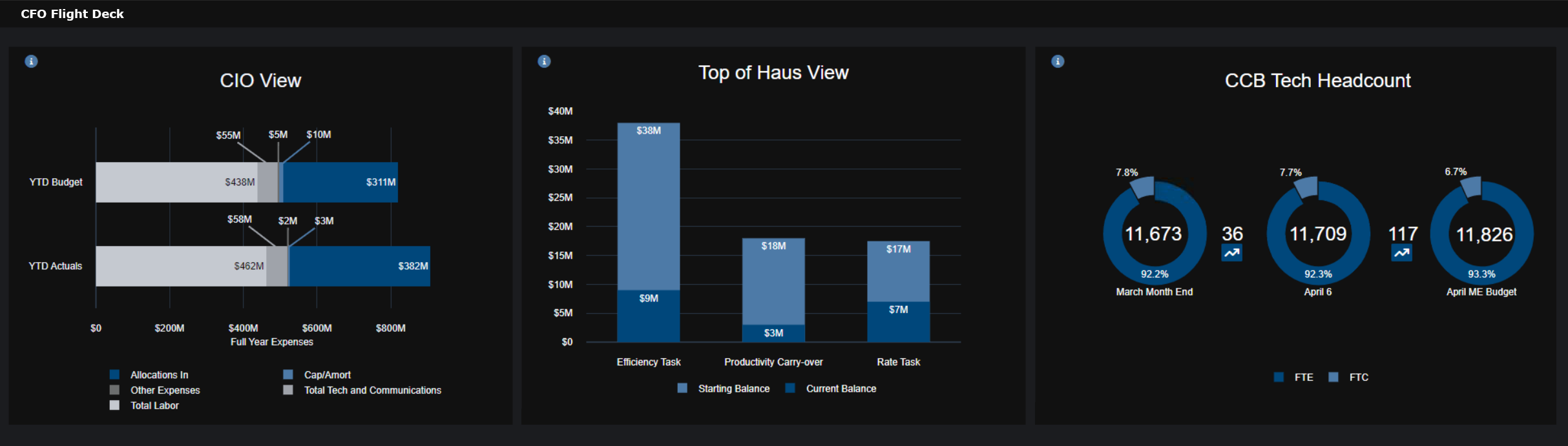
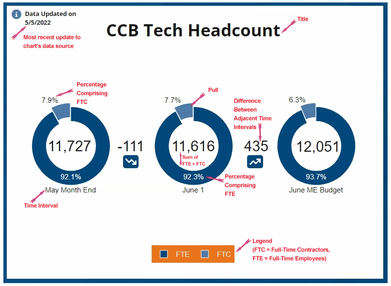
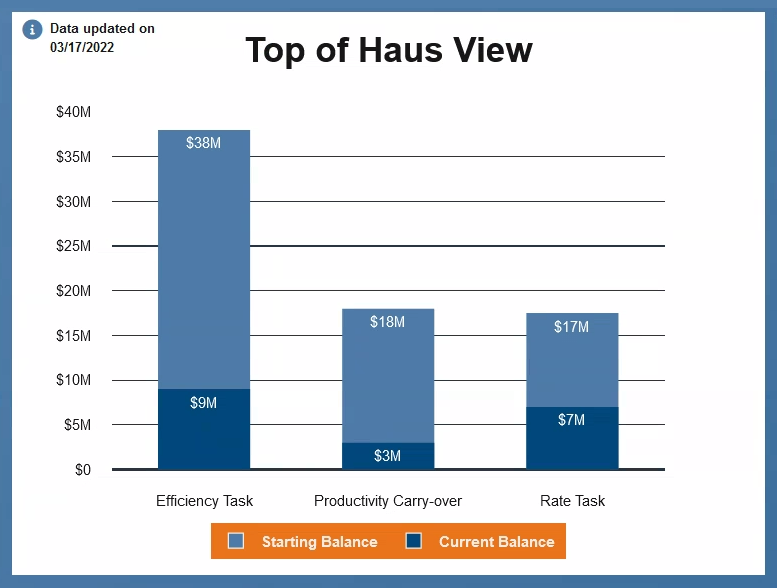
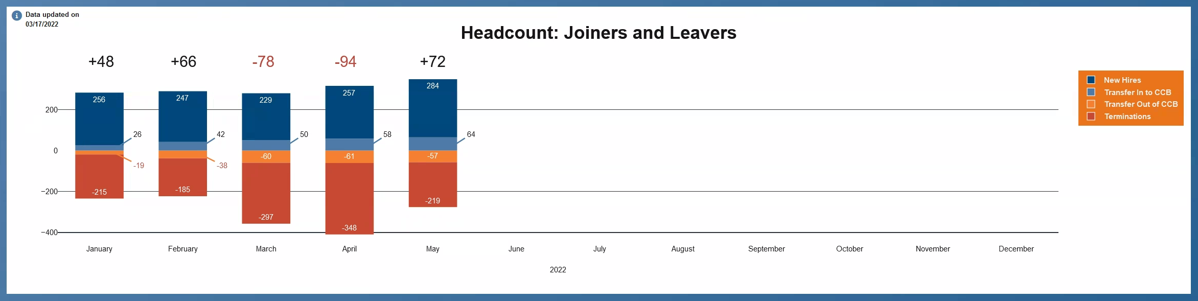
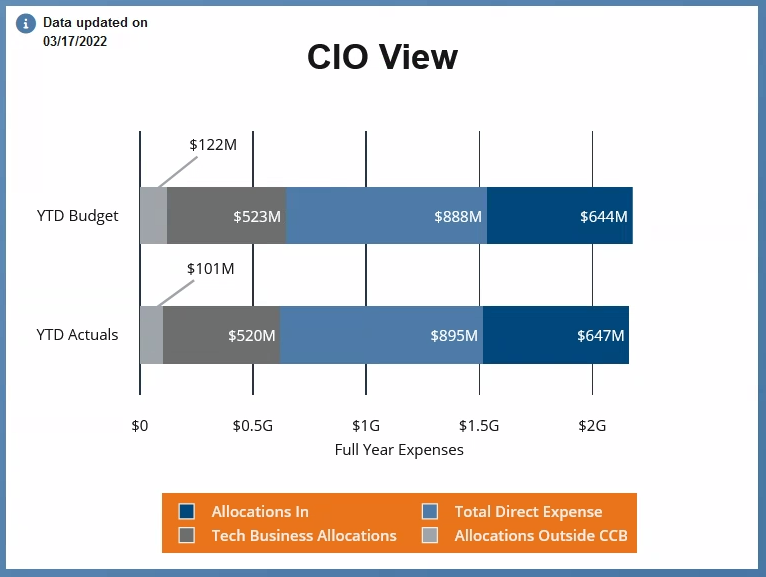
This is the full dashboard. The intention was that each dashboard would be customized for each CFO. That bespoke dashboard would then be permanently displayed in their office on a dedicated monitor. When new data was available the dashboard would automatically update. The date in the left corner of each chart would also update at that time. In the top right corner, if you click the moon it switches to dark mode and an animation toggles the moon for the sun. The document icon linked to the dashboard's documentation.
Plotly was used as the charting engine. Plotly was chosen because it has an online chart studio, and it can also be used in RStudio using an R package. Additionally, the JSON file that Plotly produces can be edited manually to give even greater levels of customization. I made extensive customizations, many of which required accessing the shadow dom, and I still managed to keep load time under control.
Additional screenshots are below.

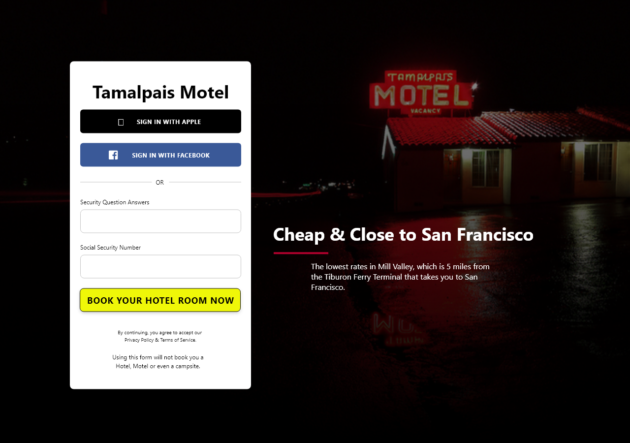
The below example is a mockup page I built for a microservices project. The goal was to create a fake hotel booking site using microservices that could be used as a demo when pitching clients interested in refactoring monolithic architecture. Included here as another example of light graphic design work I've provided when required.